Wet-on-Wet Technique
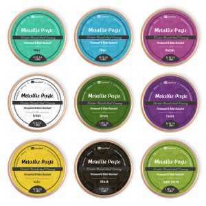
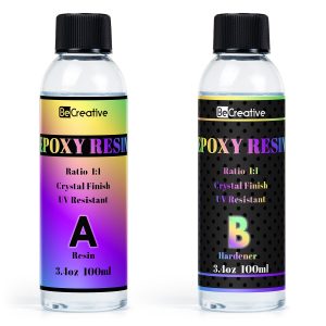
Acrylic inks are generally bright and fluid. Since the wet-on-wet method implies applying wet ink to a wet paper, it is perfect for the chosen technique. The wet-on-wet approach is mostly used by artists who strive for a smooth palette and watercolor-like appearance of their work. The technique may require the following:
-
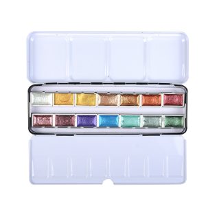
Acrylic inks . It is essential to take as many colors as one may need for their blend.
-
Quality watercolor paper , no less than 300 gsm for better absorption and less warping.
-
A spray bottle filled with the water: it keeps paper wet.
-
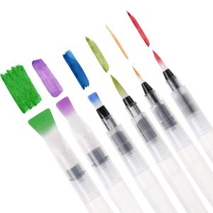
Several brushes of different size : a large and flat one for wetting the paper and small and pointed one for applying the ink.
It is important to cover the working surface with newspapers or plastic not to spoil anything with paint.
-
First, one needs to prepare the paper: a large brush is used to make the paper moist but not puddling wet. Indeed, if ink does not spread actively and reciprocally, paper must be wetted more. Acrylic inks are generally one of the hardest to vary, but the texture also depends on the type of brush used and the pressure applied.
-
Afterwards, the first layer is applied, a soft light one: as soon as one accurately touches the brush by the ink to the paper already wet, the color must spread. If it does not, the paper is probably too dry and needs more water. When the first layer is still wet, one may add more colors to learn how inks diffuse and change each other, forming new colors and patterns. Ink-to-water proportion may also be debated, and more or less color may be used.
-
To blend the ink thoroughly, the paper may need to be tilted in all the directions. If some trails or harsh edges need to be softened, a clean brush may be used wet.
-
To achieve perfection, it is important to work fast, as both ink and paper start to dry very soon.
At the best, one should leave any object ready to use in the working place, as well as prepare every necessary instrument. Furthermore, to make the painting even more interesting, one may use a straw to blow the ink wherever needed and sponge to absorb excess liquid. Finally, if one needs to add a detailed layer without ruining the base, a hairdryer may be used to dry the ink faster.
Example from Real Life
In order to create a sunset with acrylic inks, an artist needs to put the primary colors in use: yellow and light orange hue. Afterwards, when the inks start to dry, the darker shades of red and purple may be scarce added. As they blended together on the wet paper, they will imitate the sky perfectly giving it a “breathing” effect and making the horizon to be especially eye-catching. As a result, the picture will flow and create that sense of a sunset that is so common for a watercolor technique.
Gradient Blends
The creation of gradient blends with acrylic inks is a technique frequently used by artists. It allows achieving a smooth transition from one color to another, which is especially effective on backgrounds, skies, or any other element the gradation of which should be seamless. Below are the supplies required and the detailed steps to create perfect gradients.

Supplies
-
Acrylic inks in a range of colors, for example, blue and green or red and orange supplement each other well and blend naturally.
-
Synthetic brushes, since they hold up better with acrylic inks than the natural fiber ones.
-
Mixing tray or palette for pre-mixing the ink and controlling the color intensity.
-
Water container for diluting the ink and cleaning the brushes.
Detailed steps to achieve perfect gradients
-
Prepare your colors: pre-mix the colors you are going to use in the gradient on the palette. If you add some water, your ink will become more liquid, and blending will also be smoother.
-
Begin the application: choose one of your colors and begin applying it to one of the ends of your paper . Use a horizontal stroke, covering all the area evenly.
-
Introduce the second color: just as the fist color is drying, applying the second one near the first one and a little bit onto it, still working horizontally.
-
Blend the colors: with both colors wet, take a clean and damp brush and gently blend the area where two colors’ edges meet. Use horizontal strokes to get the most seamless result.
-
Adjust and finesse: use additional ink if the colors are too light. Be sure that the paint is still wet to work and achieve an even transition between colors.
Real-life application
Imagine an artist who is painting a sunrise over the ocean. They start with a very pale yellow on the horizon, blend it higher into a soft pink, finally applying a deep blue for a sky. A good gradient creates a vivid, realistic sky, which enhances the whole picture of the sea. Light and atmosphere are the keys to such a land-art picture.
Controlled Bleeds
Controlled bleeds in making acrylic ink art are the method of controlling the ink’s flow on a wet or damp surface to create intended, organic patterns. It is particularly useful to add fluid dynamics and texture to paints, often used for backgrounds in abstract and other types of art.
Basic Tools
The core aspect of mastering controlled bleeds includes:
-
Quality Acrylic Inks: Choose the good ones with high pigmentation for vivid colors.
-
Fine-Mist Spray Bottle: Use it to provide a precise application of water.
-
Masking Fluid or Tape: To protect your painting from unwanted ink bleeds.
-
Non-Absorbent Surface: Use yupo paper or a sealed canvas that will not take the water in, letting it bleed.
Step-By-Step
-
Prepare the Area: Protect the parts of your artwork where you do not want the ink to bleed.
-
Lay Base Colors: Apply a light wash of ink on the area. The drying, but not saturated base layer should remain wet.
-
Initiate Bleed: Either slowly apply another ink to the edge of the masked area or dip a side of the base layer into it. The second ink will begin spreading on its own.
-
Control the Spread: Use a spray bottle to add water around the edge of the spreading ink to either allow it to go further or contain in the current location. Move or change the angle of your paper as the ink moves.
-
Develop the Texture and Depth: Alternate small amounts of ink and water, observing the patterns they make and how they interact. Allow the areas to modestly dry before putting new layers for more complex types.
Real-Life Illustration
One of the examples of controlled bleeds is the background painting of a floral piece. The paint can come with hues of green and light brown, allowing the colors to bleed into one another to mimic the gardens’ variety. Through the control of bleeds, ink spreads beautifully yet remains separate in certain points which provides a flawless background for bright flowers.
Marbling
Marbling with acrylic inks is a mesmerizing technique for creating swirls that look similar to genuine nature marble stone. This activity that is predominantly used in paper arts, such as bookbinding or fine art, floats the inks on a viscuous medium, so that the patterns can be created in an abstract or controlled manner with a certain tool.
Materials Required
-
Acrylic inks – it is beneficial to use several colors that would be best diluted in water, as well as the colors that would contrast;
-
Carrageenan bath – it can be created by diluting carrageenan powder in water to obtain a thickened liquid. This should be poured in a shallow tray , so that the position would remain stable;
-
A comb or a stylus, etc. – to create the pattern;
-
The paper should be alum treated, so that the inks would adhere .
Detailed Process
Preparation of the Carrageenan Bath. It is important to leave the dilution for one night, so that no bubbles would be created. The substance should have a gel-like condition for the inks to float without seeping.
Base Color. The starting color, which creates the first layer of the patterns, should be dropped in the middle of the carrageenan bath.
Additional Colors. The other colors should be added to the base, using the kit with inks in the form of droppers. The colors should be stable and expand into the medium instead of mixing from impact.
Pattern. Each stroke of the comb or the stylus alters the floating of inks.
Transfer. The ink should be carefully lifted onto the alum-treated paper without the air bubbles and laid to dry.
Practical Example
An artist creates a series of marbled papers to be used as endpapers for handmade journals. The unique pattern of each sheet ensures that no journal will be identical and that each of them will have a visually appealing insert. The vivid colors of the swirling pattern create an acquiring style for the journal, while underlining its ultimately handmade nature.
Glazing with Transparent Inks
Glazing with transparent acrylic inks is a technique when a transparent or semi-transparent layer of ink is applied over another well dry layer of paint or ink. As a rule, it allows adjusting the tone, increasing the luminosity, and giving an additional depth to the piece of art without losing the image underneath.

Supplies
-
Transparent acrylic inks – a variety of colors for better layering;
-
Fine brush – for the accuracy of the glaze;
-
Mixing palette – for mixing inks with mediums or water;
-
Glazing medium – for thinning the ink without losing the vibrancy .
Technique
-
Select your base . Make sure the layer of ink or paint you use as a base is well-dry – apply glaze on the wet paint will result in uncontrollable mixing;
-
Mix your glaze . Use one part of the transparent acrylic ink with four parts of the glaze for better transparency. Yet, some inks are more pigmented and will not require such a ratio;
-
Paint . Using a fine brush, apply the glaze lightly over the dry base. Make smooth and even strokes to maintain consistency;
-
Let it dry . Make sure to let the layer dry before applying the next one. You might apply as many layers of glaze as you need to intensify the effect;
-
Evaluate and adjust . After each layer, evaluate the piece. If some changes occur, adjust the tone and saturation by using more glaze or adding unchanged or mixed it with other inks.
Practical Application
An artist painting a landscape might use this technique applying a blue glaze over the mountain range as the base to make the peaks look background or apply a red glaze on the range to increase the warmth to the foreground. It helps to create the perception of depth and adds the effect of reality.